Activity Counter
Designing reinforcing nudges to encourage participant engagement
One of Nyord’s core mechanisms to leverage collective intelligence is peer reviewing. This case study explores how we redesigned the collaboration space so that participants felt motivated to engage with each other’s ideas. The result: strong improvements in collaboration and insight quality.
- User Research
- Behavioral Design
- Interaction Design
The challenge
Nyord offers a space for tapping into a group’s collective intelligence: people post their thoughts, ideas or proposals, then review each other’s inputs to surface what matters most to the group. When we launched our first pilot projects in mid-2024 as a small early-stage team, our main concern was that users would stay passive: Would people put in the effort to write down their thoughts?
To our surprise, posting worked beautifully. Users shared plenty, much more than we had assumed. But when it came to reviewing, the numbers suddenly dropped – people just didn’t engage with each other’s posts. In one of our first pilot projects, for example, only 6 of 18 active participants rated another participant’s input.
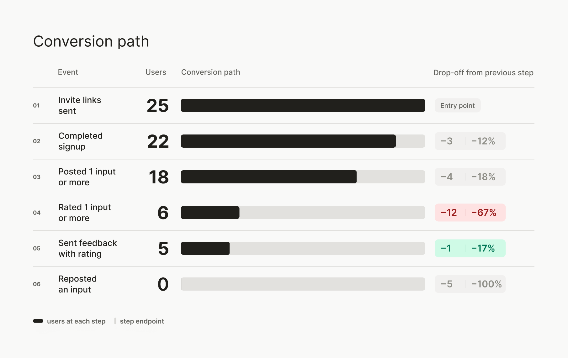
This posed a serious problem, because reviewing is where collective intelligence actually emerges. Without it, you just have a pile of random inputs. But with it, individual perspectives are turned into group wisdom. So we had to find out why people didn’t rate and comment, and what we could do about it.
How might we get people to engage with each other’s ideas?
Understanding user behavior
I couldn’t ask participants directly – they were the employees of our customers, and the facilitators who had moderated the sessions couldn’t quite explain this outcome. So my main source to understand user behavior was session recordings we took with Hotjar. Analyzing about 30 user sessions showed that participants navigated the board confidently, but when it came to rating, they would hesitate to press the rating button or only scroll through inputs slowly.
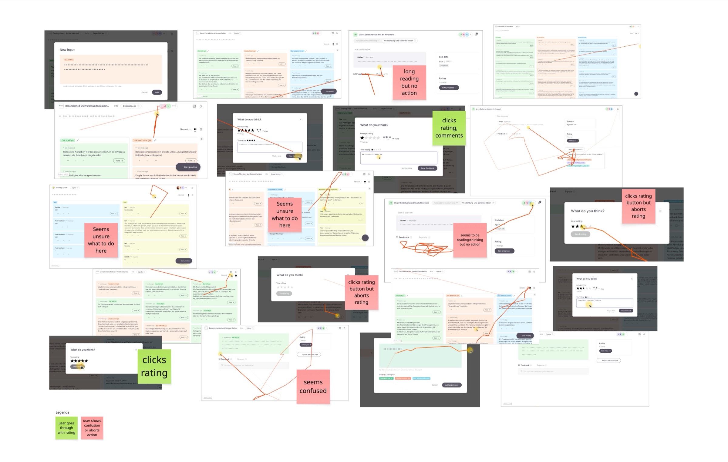
Based on the behavioral patterns, I researched possible psychological blockers that might hold people back from pressing the rating button. I discussed my findings with the facilitators, who, unlike me, knew the participants personally, and together we formed some hypotheses:
- Users didn’t grasp why rating mattered – it wasn’t a learned behavior in this context.
- Users found the volume of inputs overwhelming.
- Users weren’t clear about how much the facilitator expected them to rate.
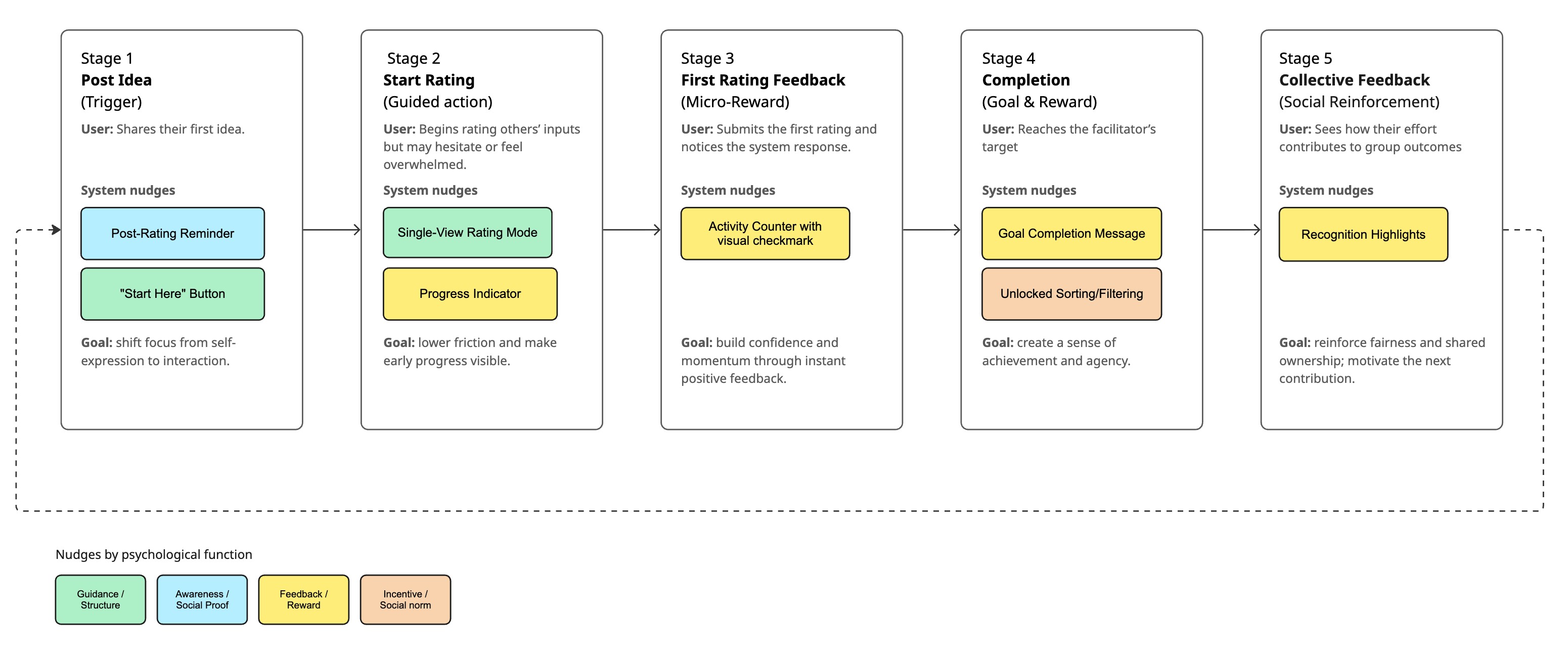
Designing reinforcing nudges
To get started on working out a solution, I gathered our whole team of five in a workshop. We first turned each of the three hypotheses into a challenge and then a “How might we...?” question, then brainstormed a wide range of ideas, from the obvious to the far-fetched.
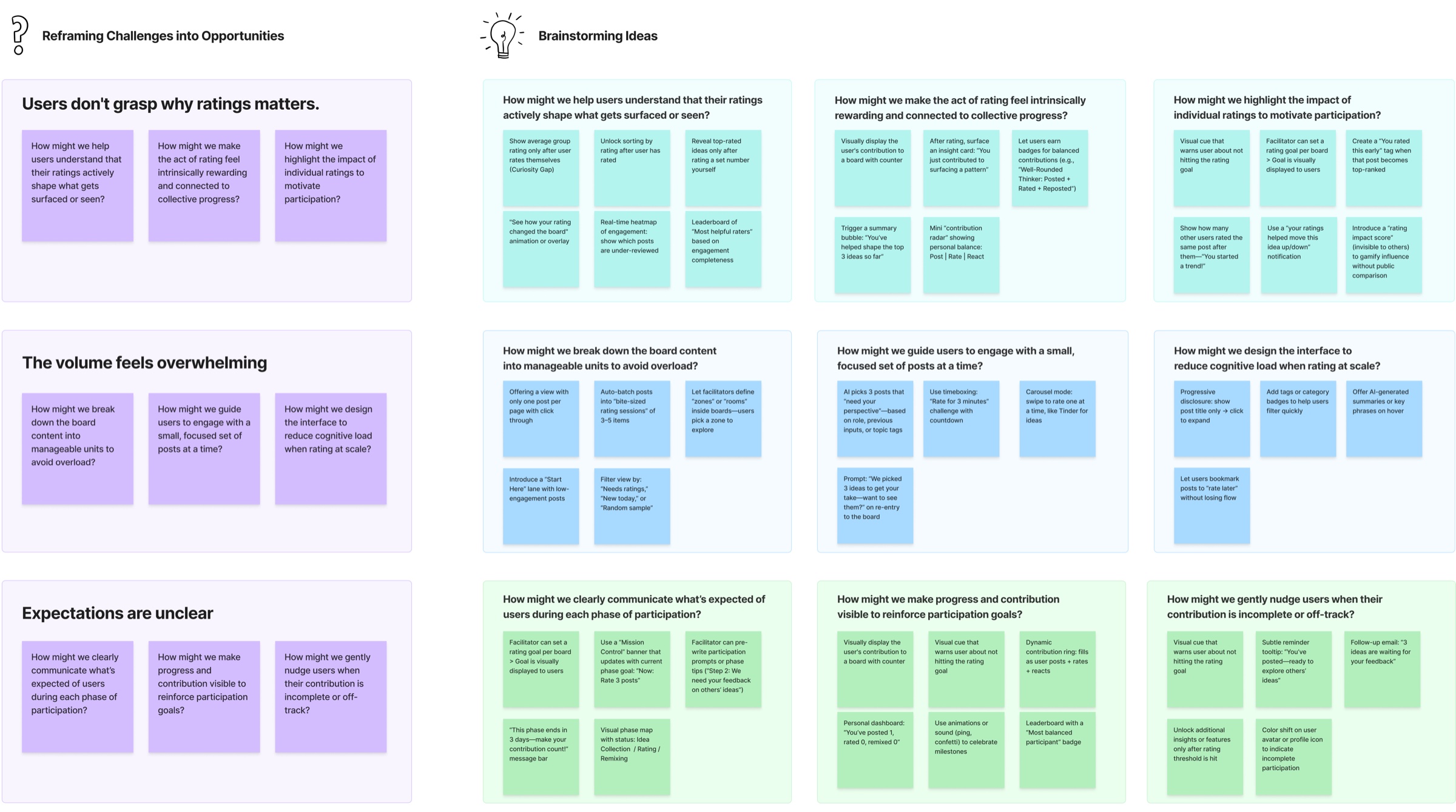
It became clear to me that the solution was not a single big change, but a series of small interface interventions, each one a nudge along the user journey to gently guide participants toward engaging with each other’s inputs. Each one is small on its own, but together they could form a reinforcing cycle.
I focused on three areas:
- Making rating more attractive with feedback mechanisms and visual progress
- Making rating easier with a guided flow and single-input view
- Making expectations around rating clearer by offering the right clues at the right time
We also explored the idea of badges and leaderboards to make rating more fun and rewarding, but decided to exclude them for now. It seemed risky, because one of our largest customers was a German research organization and a playful approach might have alienated some users. We would need more research to pursue this direction.
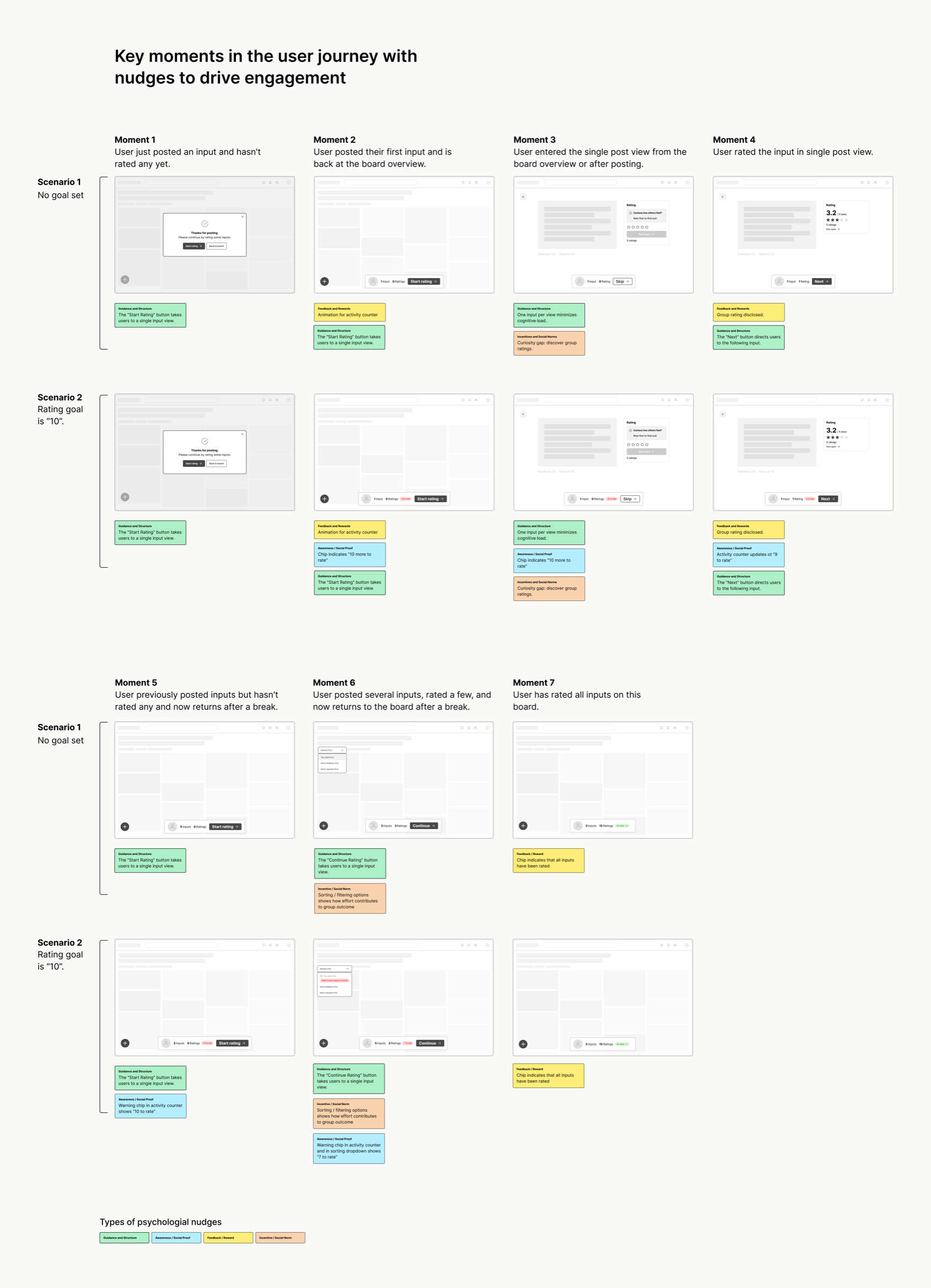
Wireframing key moments in the user journey
For each key moment – like when arriving on the board for the first time or rating after posting the first idea – I drafted which nudge to apply.
One question I explored was whether a facilitator should set an explicit rating goal for participants, e.g., “Rate 10 inputs.” It was a trade-off: A rating goal would make it easier for the facilitator to communicate expectations and the nudges more effective. But it could also lead to participants feeling pushed.
I decided to implement rating goals and leave it to the facilitator to turn them on in the board settings.
Designing interaction patterns
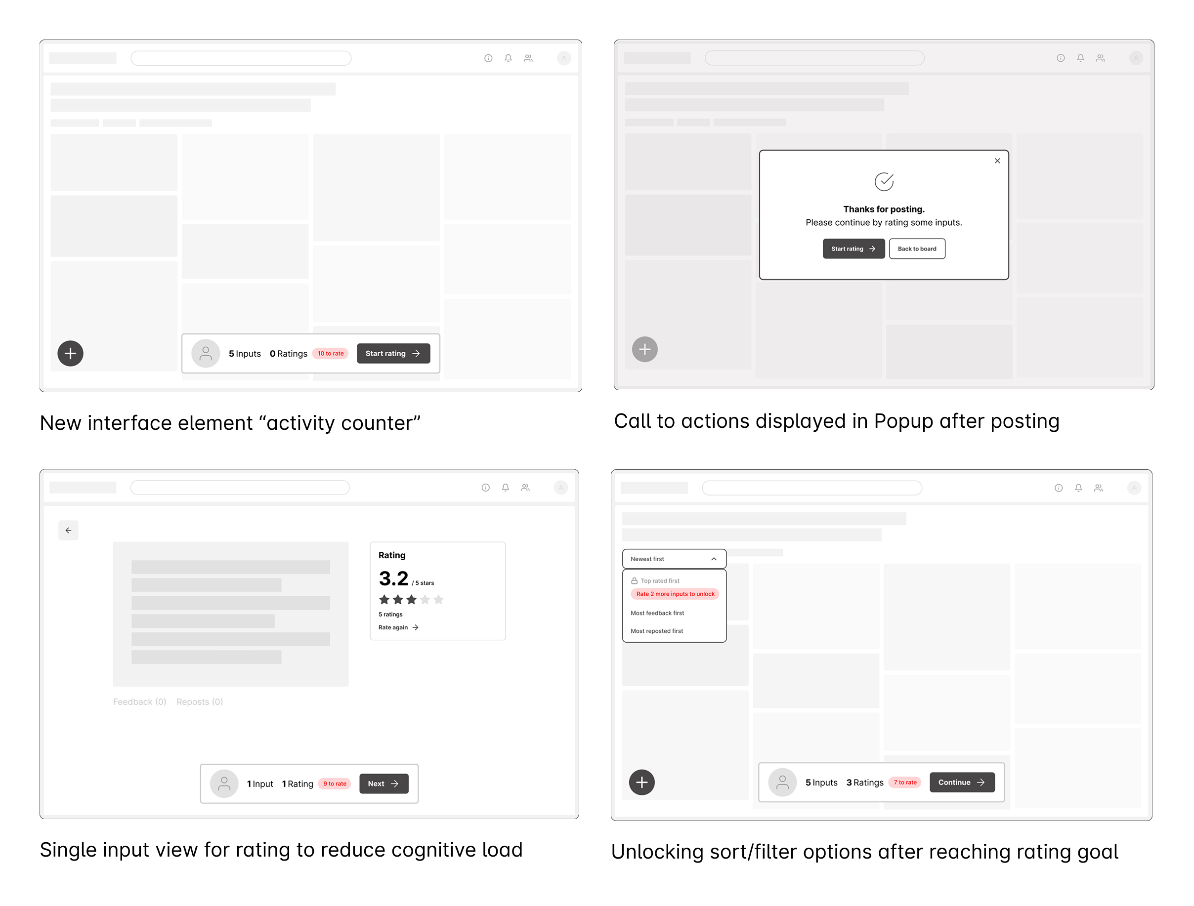
From the wireframes, four new interaction patterns emerged.
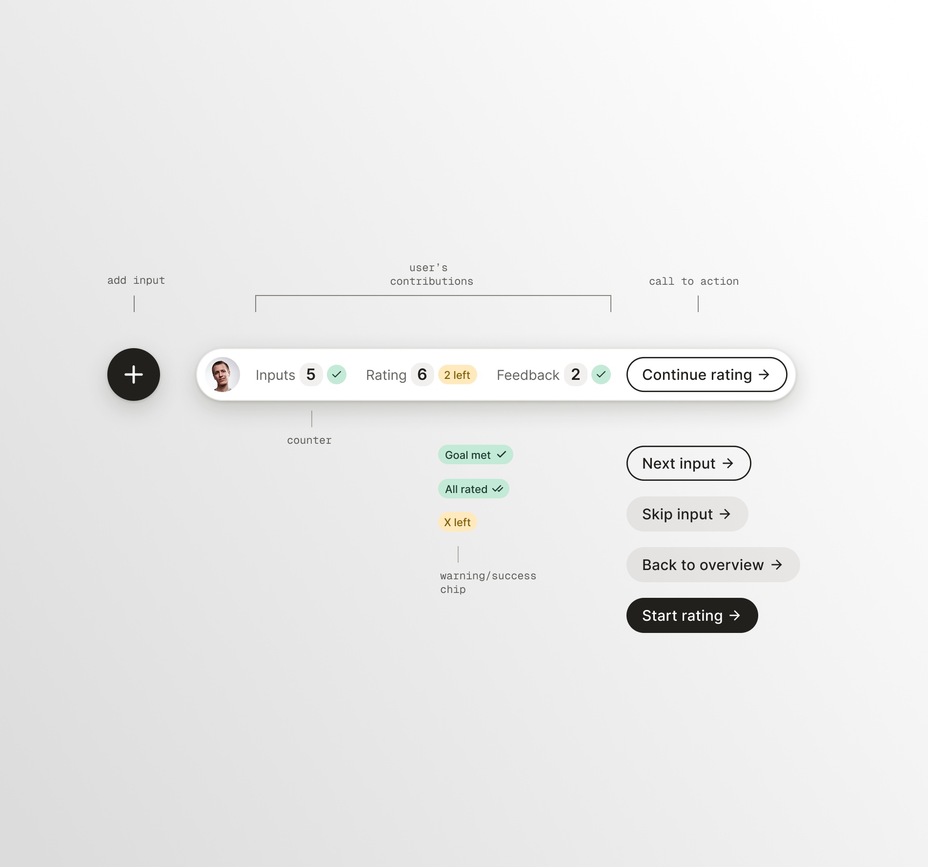
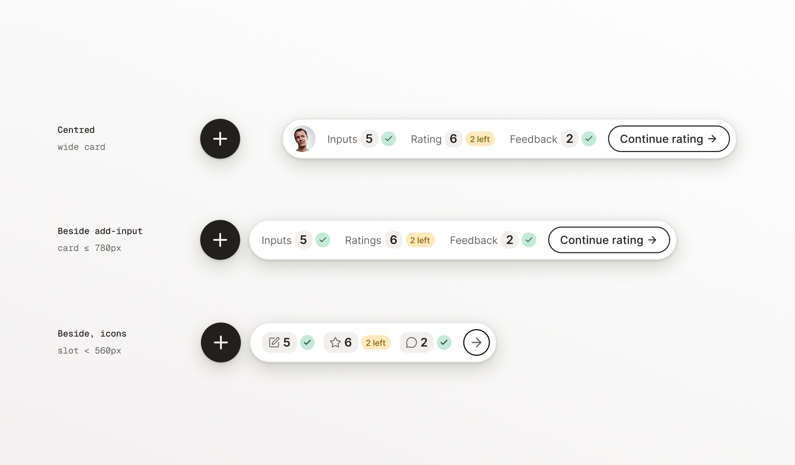
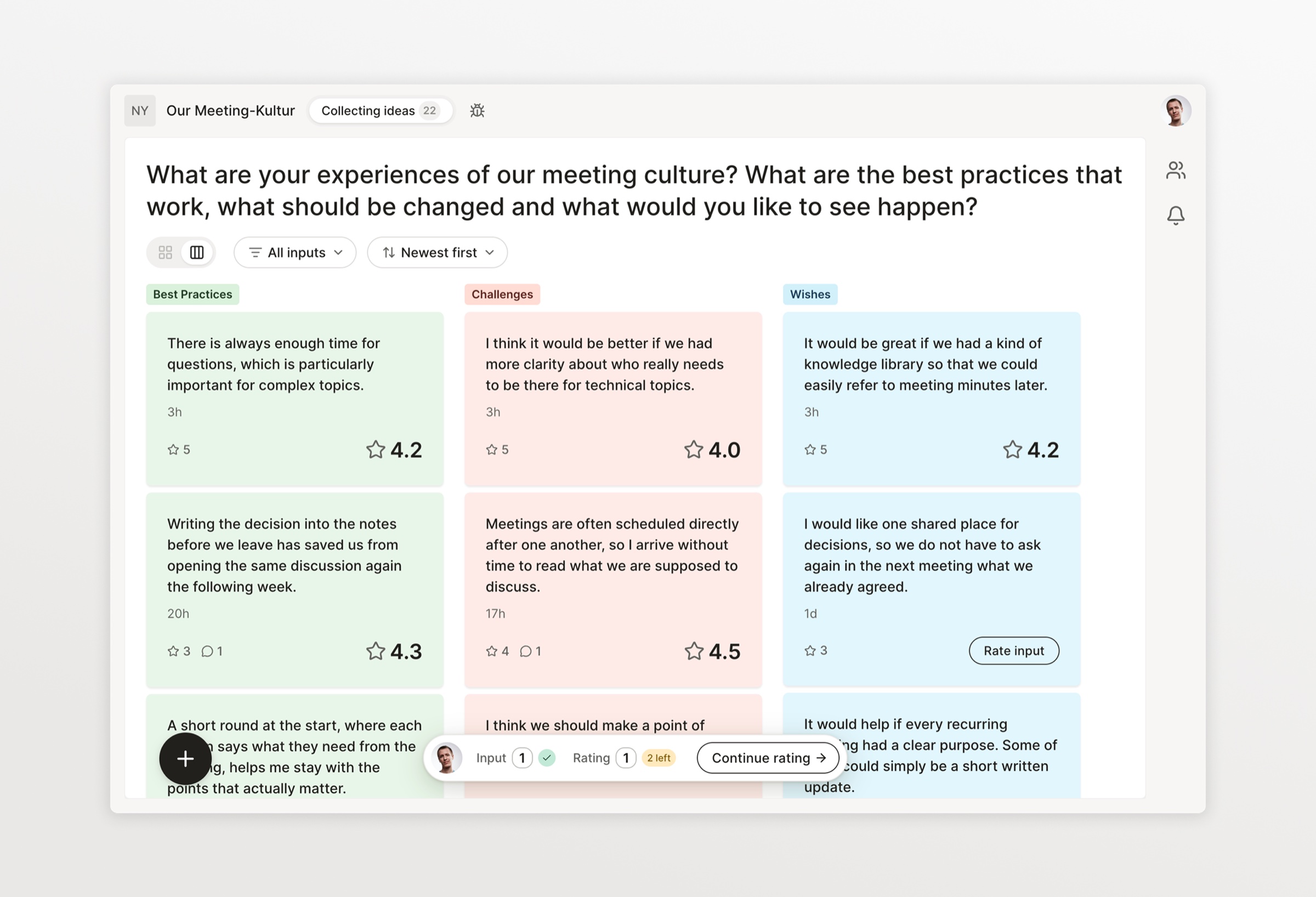
The centerpiece was a new interface element, the “activity counter,” a small bar pinned to the bottom of the board. Its job was to make participants more aware of their own contributions, remind them to complete their goals, give feedback on success, and serve as guidance on what to do next.
The other three were a single-input view with navigation (next, skip) to make rating easier and more rewarding, a reminder to rate in the modal after posting, and locking sorting and filtering options until the rating goal was met.
Validating with customer feedback
Before committing to building, I wanted to ensure the concept resonated. I created some initial mockups of the new interface elements and a comic-strip-style storyboard. It tells the journey of Paula, a facilitator aiming to improve her team’s engagement on the platform, and Tom, a first-time participant discovering the platform.
Reviewing them with facilitators at three customer organizations confirmed the direction. My interview partners particularly appreciated having a lightweight way to set expectations with rating goals. So we went ahead.
The activity counter component
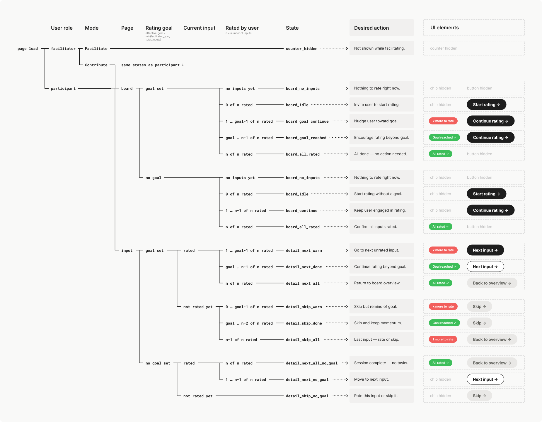
Small as it was, the counter had to work in many different situations: For example, on the board overview it had to direct participants to start or continue rating, while on the input detail page it served as navigation with buttons turning into next/skip calls to action.
It had to adapt to the board settings – if a rating goal was set, it would nudge the user toward completing the goal; if not, it would still give positive feedback signals upon rating.
For facilitators it didn’t show unless they turned on “contribute mode,” a mode that we had initially built to let facilitators put themselves into the shoes of a participant.
I laid out all possible combinations and mapped each resulting state to a desired action, like “start rating” or “go to next input,” and its corresponding UI elements: an activity chip for warning or success and a call-to-action button. This state logic became the basis for building the component.
In the final UI, the activity counter sits right next to the “Add input” button. Both float above the board, so everything participants can do is close together and separate from the board content.
Impact
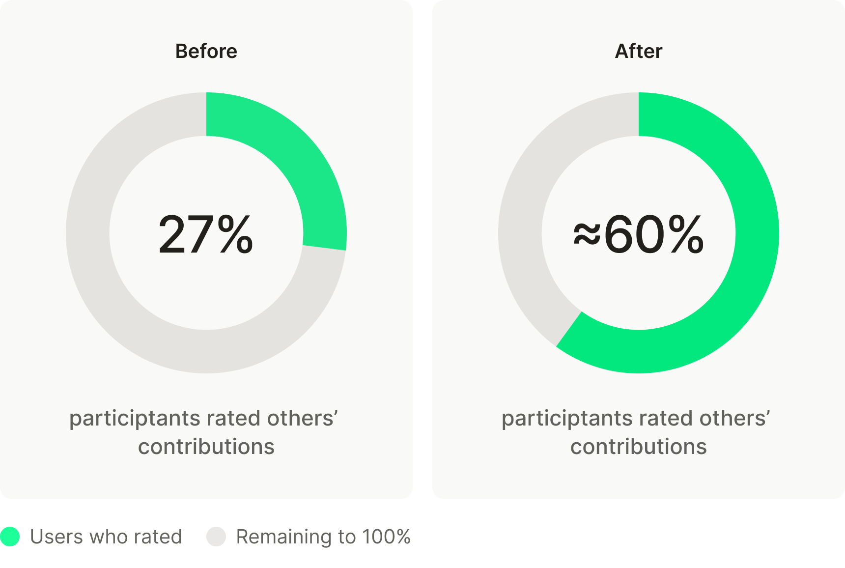
In several pilot projects following the feature launch, rating activity was between 53% and 66%, which means it roughly doubled compared to before the redesign.
For facilitators, this was the real win: instead of a pile of inputs, they now had a clear signal of what mattered most to the group.
“After the redesign, people finally rated each other’s contributions instead of just dropping their own ideas. It was a simple change, but it made the whole workshop more balanced and valuable.”
Learning
Surprisingly, goal-setting was used less than initial feedback had suggested. A possible explanation: Over time, I observed that the tool gained traction in hybrid settings, where Nyord was used as part of longer projects that also included in-person workshops. Facilitators could simply remind people in person about their expectations for rating, without the formality of rating goals.
Motivating participants to engage with each other’s input remains a challenge. About a third or more never rate or comment, while ideally everyone would – something that we are still working on.